Color Theory: The Mood-Lifting Design Approach to Try This Year
January 11, 2021
Twice a year, in a secret meeting, the Pantone Color Institute hosts representatives from various nations’ color standards groups. After two days of presentations and debate, they choose the upcoming Color of the Year. And since 2000, they’ve offered a whole new take on color theory: one that draws on influences from art, film, nature, and socioeconomic conditions to pinpoint a shade that perfectly connects with the zeitgeist.
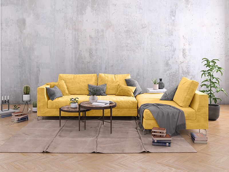
For 2021, they’ve selected two colors: Illuminating, a bright, bold yellow; and Ultimate Gray, a strong, stable companion. These shades, Pantone says, are independent but complementary. It’s a combination that represents mutual support, strength, and optimism—and is certainly one that taps into the current mood for creating a bright, uplifting spot within our homes.
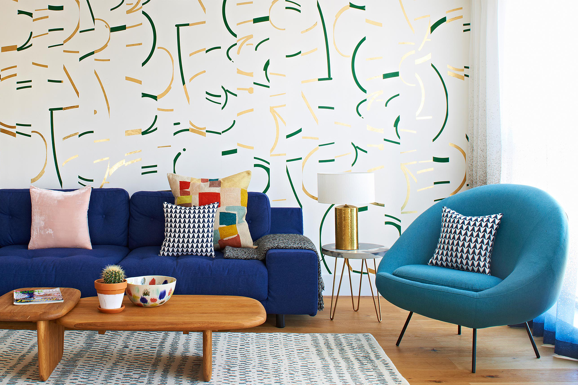
“Yellow is the lift in spirits many of us need,” say Jordan Cluroe and Russell Whitehead. As the authors of Making Living Lovely and founders of London-based 2LG Studio, the pair are renowned for their unconventional use of color in interior design—and know a thing or two about different hues.
“Pantone’s shade has just the right amount of green in it to stop it feeling too yolky or cloyingly warm," Whitehead explains. "It can work beautifully to add a little positivity to your home.” On the other hand, Ultimate Gray, he says, adds an element of “urban authenticity.”
Color’s ability to communicate these kinds of nuances about our surroundings is well established, says Karen Haller, an applied color and design psychology expert and author of The Little Book of Colour. “Different shades make us feel something. They have the power to change our emotions in an instant.”
Related: Explore 8 Stylish Homes That Fully Embrace Color
</div>
</div>
“The way you feel in a room has so much to do with the colors,” Whitehead agrees. “Color is sensual and emotional. It can lift your spirits or calm your mind depending on how you use it.”
Whitehead, along with Cluroe and Haller, will soon share their wisdom as contributors to The Complete Book of Colourful Interiors by (Lannoo Publishers, to be released in March). But here, they offer an exclusive first glimpse of that advice, with tips and insights on how to choose shades to energize your space.
Choose a Hue That’s You
The first step to selecting a color that’s right for your home, says Haller, is finding a palette that speaks to you. “Choosing to surround yourself with colors that resonate with your personality—whether that’s bright and bold, or subtle and soothing—means you’ll create a home that you love and that loves you back,” she explains.
Related: View The Colorful Interior Designs of Ghislaine Viñas
To do so, Cluroe and Whitehead recommend starting out with some colorful contemplation. “Think about how you dress yourself, the flowers you love, your favorite houseplants, or foods. Even a song or a film you love can be a great starting point for a color palette. Be open to the all the shades surrounding you, especially those that evoke an emotional response.”
Tone it Up
Once you’ve found the range of shades that are right for you, our experts advise getting a little adventurous. “It should be all about freedom. We don’t subscribe to concepts of masculine of feminine colors—you should feel free to love whatever color makes you feel good,” says Whitehead.
Related: Read an Expert’s Thoughts on the Future of Interior Design
“Approach color with confidence. Sometimes shades that you thought wouldn’t work can come to life when they’re put together. Allow yourself time to mix and match swatches and objects, and keep editing until you have three core colors that can become a strong, clearly defined basis for a wider palette.”
“You can take it further by playing with different tones of the shades you’ve chosen to create even stronger combinations. Try not to discount anything: even a hue you hate can have a valid place in a scheme if it lifts your hero color in an interesting way.”
Make an Entrance
So where to begin? Whitehead recommends starting with a hallway. “This space can often be an afterthought, but at 2LG we love to go big with color in an entrance. It’s a space that you don’t linger in, so it can take bold impact and creates a great first impression of your home.”
Although he has one a final rule for the color selection you settle on—"always choose something that conjures joy.”
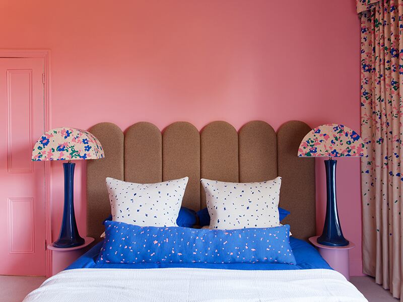
Banner image: A studio apartment in London designed by 2LG Studio. Megan Taylor


